
http://www.washingtonpost.com/lifestyle/home/house-calls-make-room-for-music-and-play/2013/06/25/8add3a64-d774-11e2-a016-92547bf094cc_story.html
The article really doesn't explain the level of difficulty in this design challenge, but I will!
If you take a look at the article, you will find a picture of what the space looks like now! But here are some more.


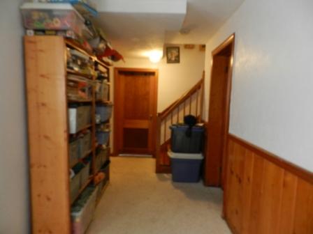

They wanted this area of their home to have multiple purposes. When I first looked at it, I have to tell you, I was stumped! Even my kids playroom isn't this filled with stuff! Not only do they want to keep the kids play area, they also wanted the husband to be able to keep his drum set there, have a sofa/seating area, storage, home office and laundry area. OMG, say what now! Well GAME ON!!!!
Well after racking my brain over several different layouts I came up with this one.

The hall area is the perfect place for the office area. It's rather wide in the hall and can house a nice size desk and shelving for more storage. Top it with this cute lamp from Pier1, texture texture texture! Across the hall I added a mirror to bounce some more light around the space. Add this garden stool for color.


The owner wants to change the flooring to tile...so...I suggested they add an area rug for warmth and sound control. OK, as a designer I would try and talk them out of changing the flooring to tile. If they are going to have kids on the floor and BLARING DRUMS in the space they are going to want a material that will be soft of the feet and absorb sound. But hey that's what they want.

Since the space isn't that large I opted not to have a 3 seater sofa. Honestly, no one want to sit in the middle....lol. So instead I placed an armless loveseat and a side chair in the far corner to create a good seating area where you can actually sit and have a convo. I choose the armless because it was less bulky in this tight space. Next to the sofa I added nesting tables. I love nesting tables. They are great conceptually and great functionally. You can tuck them under one another to save space or you can pull them away from each other to create separate surface space. The lamp I chose is PRICEY, but I just love the glass and mesh combo. Casual Elegance. LOVE IT! The sofa pillows are two lumbar pillows done in a P Kaufman fabric. You can find custom pillows like these on Etsy.com


I love coffee tables, but I love OTTOMAN coffee tables even more. They are all over my house...lol. Seriously! They are very kid friendly, comfortable to put your feet up, and another great way to add texture and color to the space with fabric.

Some of the accessories I picked I chose with the kids in mind. I added some floor pillows for reading and playing. These bicycle figures are fun too.


I think house plants always add life to a space and so I tend to put them in all my designs. However, if you're like me they will be dead before the week is out. So this faux ficus is great for areas that don't receive a lot of light. Place is on top of this Mocorran side table for height. I placed it next to the storage units becasue I could not run the units all the way down to the wall because of the door. I didn't like the blank space, so this fills it out great.


Lastly, I want to mention the wall color. Again if you look at the article and pix above you will see the space has this VERY dated dark paneling on the bottom half of the wall. It's creating this crave like atmosphere and in a perfect world with lots of money I would have told the home owner to just get rid of it, but since they are working with a tight budget, let's just paint it a soft off white and on the top half of the wall I'm thinking a calming cool blue-gray color. Benny Moore's Nimbus Gray is perfect.

Ok, lastly...the short stubby windows. Most homes with a finished basement have these high up windows, and no one knows what to do with them. I would suggest a double rod with white sheers in back and color side hanging drapes to add height. This will keep your eye from reminding you that you are partly under ground.


As for some of the other challenges in the space....the owner didn't ask me to address these, but I feel as a designer it's my job to be thorough. The lighting in the space is currently a LARGE (and I do mean L-A-R-G-E) fluorescent fixture. IF budget permits, they should really invest in recessed lighting set on a dimmer. This will be much better task lighting for playing, laundry, etc. The laundry area needed doors! I would put floor to ceiling bi-folds on the closet area housing the appliances. This way you can keep it out of sight, but still have easy access when needed. Why bi-folds?....They take up less floor space to open.
Well I hope you enjoyed that! Don't hesitate to email me you design dilemmas and I'll see what I can do. thatsyourqdesigns@gmail.com.
Ciao for Now.
No comments:
Post a Comment
Please leave your comments below, I love hearing feedback.